CSS стили для Checkbox
В каждом проекте приходится стилизовать Checkbox, поэтому написал несколько стилей для применения в разных макетах.
Все примеры можно посмотреть на codepen

HTML разметка для примера:
<div class="section">
<div class="container">
<div class="checkboxes">
<div class="checkboxes__row">
<div class="checkboxes__item">
<!-- CSS стили описаные ниже для этого блока -->
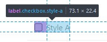
<label class="checkbox style-a"> <!-- Вся область checkbox -->
<input type="checkbox"/> <!-- Cтандартный checkbox скрываем, но он обязателен для определения состояния(отмечен или нет) -->
<div class="checkbox__checkmark"></div> <!-- Область отметки -->
<div class="checkbox__body">Style A</div> <!-- Область описания -->
</label>
</div>
</div>
</div>
</div>
</div>
<label class="checkbox style-a"> - Родительская label обертка с классом checkbox и классом стилей style-a, используется для того, чтобы активная область была на всех внутренних элементах, то есть можно нажимать не только на сам checkbox, но и на область описания checkbox
<input type="checkbox" checked="checked"/> - обязательный скрытый input для определения состояния checkbox
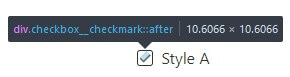
<div class="checkbox__checkmark"> - область отметки checkbox
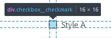
Отметка добавляется через псевдо-элемент :after относительно <div class="checkbox__checkmark">
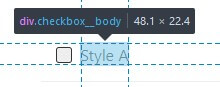
<div class="checkbox__body"> - область для описания checkbox, может быть текстом, изображением, элементом и так далее
Небольшое отступление для понимания:
Селектор
~ (тильда)выбирает соседние элементы, находящиеся на том же уровне, но после выбранного элемента
Проще всего понять на примере:
<label class="checkbox style-a">
  <input type="checkbox"/>
  <div class="checkbox__checkmark"></div>
  <div class="checkbox__body">Style A</div>
</label>
/* Верно */
input ~ .checkbox__checkmark {} /* выбирает .checkbox__checkmark */
input ~ .checkbox__body {} /* выбирает .checkbox__body */
.checkbox__checkmark ~ .checkbox__body {} /* выбирает .checkbox__body */

/* Не верно */
.checkbox__checkmark ~ input {} /* выше расположеный input НЕ БУДЕТ выбран */
.checkbox__body ~ .checkbox__checkmark {} /* выше расположеный .checkbox__checkmark НЕ БУДЕТ выбран */
Также для более логичного поведения при установке размеров элементов использую box-sizing: border-box; для все элементов
*,
*::before,
*::after {
  box-sizing: border-box;
}
Если в проекте не используете box-sizing: border-box;, то можно установить это свойство только для стилизованного checkbox
/* Для самого блока .checkbox */
.checkbox,
.checkbox::before,
.checkbox::after {
  box-sizing: border-box;
}
/* И для его дочерних элементов */
.checkbox *,
.checkbox *::before,
.checkbox *::after {
  box-sizing: border-box;
}
Иначе возможны различия с примерами во внешнем виде
Можно почитать отдельную статью - Почему размеры блока больше заданных
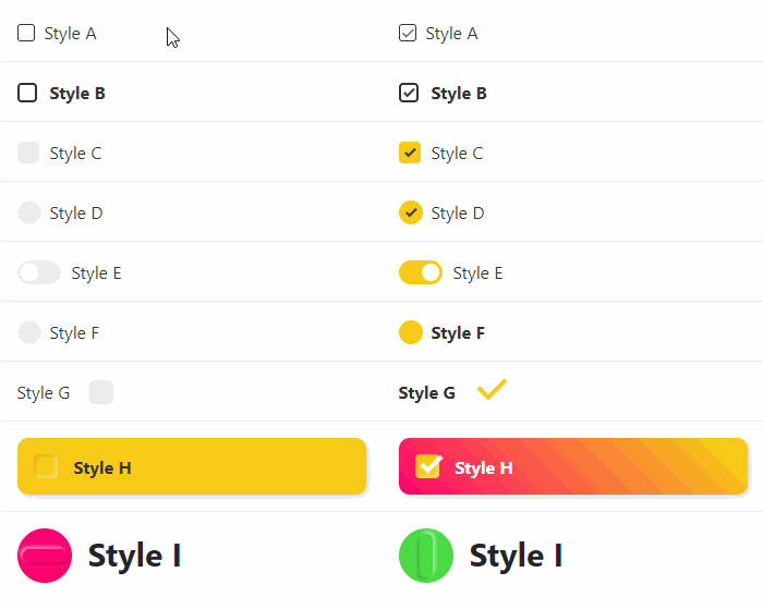
Описание стилей
Style A

.checkbox.style-a {
  display: inline-block;
  position: relative;
  padding-left: 25px; /* Так как .checkbox__checkmark имеет position: absolute; оставляем для него свободное место */
  cursor: pointer;
  user-select: none;
}

/* Скрываем стандарный input */
.checkbox.style-a input {
  position: absolute;
  opacity: 0;
  cursor: pointer;
  height: 0;
  width: 0;
}

/* Если input отмечен(:checked), то .checkbox__checkmark(область отметки), применяет данные стили */
.checkbox.style-a input:checked ~ .checkbox__checkmark {
  background-color: #fff;
}

/* Если input отмечен(:checked), то псевдо-элемент .checkbox__checkmark:after(отметка-галочка), применяет данные стили */
.checkbox.style-a input:checked ~ .checkbox__checkmark:after {
  opacity: 1; /* отображаем отметку-галочку */
}

/* При наведении(:hover) на всю область checkbox элемент .checkbox__checkmark(область отметки) применяет данные стили*/
.checkbox.style-a:hover input ~ .checkbox__checkmark {
  background-color: #eee; /* окрашиваем фон в серый цвет*/
}

/* При наведении(:hover) на всю область checkbox и при отмеченном input  элемент .checkbox__checkmark(область отметки) применяет данные стили*/
.checkbox.style-a:hover input:checked ~ .checkbox__checkmark {
  background-color: #fff; /* окрашиваем фон в белый цвет*/
}

/* Исходные стили для области отметки .checkbox__checkmark */
.checkbox.style-a .checkbox__checkmark {
  position: absolute;
  top: 4px;
  left: 0;
  height: 16px;
  width: 16px;
  background-color: #fff;
  border: 1px solid #333;
  transition: background-color 0.25s ease;
  border-radius: 3px;
}

/* Исходные стили для отметки .checkbox__checkmark:after */
.checkbox.style-a .checkbox__checkmark:after {
  content: "";
  position: absolute;
  left: 5px;
  top: 1px;
  width: 5px; /* ширина - длина левой линии отметки-галочки */
  height: 10px; /* высота - длина правой линии отметки-галочки */
  border: solid #333; /* рамка(border) сплошной линией цвета #333 */
  border-width: 0 1px 1px 0; /* правая и нижняя рамка(border) по 1px  */
  transform: rotate(45deg); /* блок наклонен по часовой стрелке на 45 градусов */
  opacity: 0; /* изначально скрыта */
  transition: opacity 0.25s ease; /* для плавного появления, скрытия, перемещения отметки*/
}

/* Исходные стили для области описания .checkbox__body*/
.checkbox.style-a .checkbox__body {
  color: #333;
  line-height: 1.4;
  font-size: 16px;
}
Остальные стили
Style B

<label class="checkbox style-b">
  <input type="checkbox"/>
  <div class="checkbox__checkmark"></div>
  <div class="checkbox__body">Style B</div>
</label>
.checkbox.style-b {
  display: inline-block;
  position: relative;
  padding-left: 30px;
  cursor: pointer;
  -webkit-user-select: none;
  -moz-user-select: none;
  -ms-user-select: none;
  user-select: none;
}
.checkbox.style-b input {
  position: absolute;
  opacity: 0;
  cursor: pointer;
  height: 0;
  width: 0;
}
.checkbox.style-b input:checked ~ .checkbox__checkmark {
  background-color: #fff;
}
.checkbox.style-b input:checked ~ .checkbox__checkmark:after {
  opacity: 1;
}
.checkbox.style-b:hover input ~ .checkbox__checkmark {
  background-color: #eee;
}
.checkbox.style-b:hover input:checked ~ .checkbox__checkmark {
  background-color: #fff;
}
.checkbox.style-b .checkbox__checkmark {
  position: absolute;
  top: 3px;
  left: 0;
  height: 18px;
  width: 18px;
  background-color: #fff;
  border: 2px solid #333;
  transition: background-color 0.25s ease;
  border-radius: 4px;
}
.checkbox.style-b .checkbox__checkmark:after {
  content: "";
  position: absolute;
  left: 5px;
  top: 1px;
  width: 5px;
  height: 10px;
  border: solid #333;
  border-width: 0 2px 2px 0;
  transform: rotate(45deg);
  opacity: 0;
  transition: opacity 0.25s ease;
}
.checkbox.style-b .checkbox__body {
  color: #333;
  line-height: 1.4;
  font-size: 16px;
  font-weight: bold;
}
Style C

<label class="checkbox style-c">
  <input type="checkbox"/>
  <div class="checkbox__checkmark"></div>
  <div class="checkbox__body">Style C</div>
</label>
.checkbox.style-c {
  display: inline-block;
  position: relative;
  padding-left: 30px;
  cursor: pointer;
  -webkit-user-select: none;
  -moz-user-select: none;
  -ms-user-select: none;
  user-select: none;
}
.checkbox.style-c input {
  position: absolute;
  opacity: 0;
  cursor: pointer;
  height: 0;
  width: 0;
}
.checkbox.style-c input:checked ~ .checkbox__checkmark {
  background-color: #f7cb15;
}
.checkbox.style-c input:checked ~ .checkbox__checkmark:after {
  opacity: 1;
}
.checkbox.style-c:hover input ~ .checkbox__checkmark {
  background-color: #eee;
}
.checkbox.style-c:hover input:checked ~ .checkbox__checkmark {
  background-color: #f7cb15;
}
.checkbox.style-c .checkbox__checkmark {
  position: absolute;
  top: 2px;
  left: 0;
  height: 20px;
  width: 20px;
  background-color: #eee;
  transition: background-color 0.25s ease;
  border-radius: 4px;
}
.checkbox.style-c .checkbox__checkmark:after {
  content: "";
  position: absolute;
  left: 8px;
  top: 4px;
  width: 5px;
  height: 10px;
  border: solid #333;
  border-width: 0 2px 2px 0;
  transform: rotate(45deg);
  opacity: 0;
  transition: opacity 0.25s ease;
}
.checkbox.style-c .checkbox__body {
  color: #333;
  line-height: 1.4;
  font-size: 16px;
}
Style D

<label class="checkbox style-d">
  <input type="checkbox"/>
  <div class="checkbox__checkmark"></div>
  <div class="checkbox__body">Style D</div>
</label>
.checkbox.style-d {
  display: inline-block;
  position: relative;
  padding-left: 30px;
  cursor: pointer;
  -webkit-user-select: none;
  -moz-user-select: none;
  -ms-user-select: none;
  user-select: none;
}
.checkbox.style-d input {
  position: absolute;
  opacity: 0;
  cursor: pointer;
  height: 0;
  width: 0;
}
.checkbox.style-d input:checked ~ .checkbox__checkmark {
  background-color: #f7cb15;
}
.checkbox.style-d input:checked ~ .checkbox__checkmark:after {
  opacity: 1;
}
.checkbox.style-d:hover input ~ .checkbox__checkmark {
  background-color: #eee;
}
.checkbox.style-d:hover input:checked ~ .checkbox__checkmark {
  background-color: #f7cb15;
}
.checkbox.style-d:hover input ~ .checkbox__body {
  color: #f7cb15;
}
.checkbox.style-d .checkbox__checkmark {
  position: absolute;
  top: 1px;
  left: 0;
  height: 22px;
  width: 22px;
  background-color: #eee;
  transition: background-color 0.25s ease;
  border-radius: 11px;
}
.checkbox.style-d .checkbox__checkmark:after {
  content: "";
  position: absolute;
  left: 9px;
  top: 5px;
  width: 5px;
  height: 10px;
  border: solid #333;
  border-width: 0 2px 2px 0;
  transform: rotate(45deg);
  opacity: 0;
  transition: opacity 0.25s ease;
}
.checkbox.style-d .checkbox__body {
  color: #333;
  line-height: 1.4;
  font-size: 16px;
  transition: color 0.25s ease;
}
Style E

<label class="checkbox style-e">
  <input type="checkbox"/>
  <div class="checkbox__checkmark"></div>
  <div class="checkbox__body">Style E</div>
</label>
.checkbox.style-e {
  display: inline-block;
  position: relative;
  padding-left: 50px;
  cursor: pointer;
  -webkit-user-select: none;
  -moz-user-select: none;
  -ms-user-select: none;
  user-select: none;
}
.checkbox.style-e input {
  position: absolute;
  opacity: 0;
  cursor: pointer;
  height: 0;
  width: 0;
}
.checkbox.style-e input:checked ~ .checkbox__checkmark {
  background-color: #f7cb15;
}
.checkbox.style-e input:checked ~ .checkbox__checkmark:after {
  left: 21px;
}
.checkbox.style-e:hover input ~ .checkbox__checkmark {
  background-color: #eee;
}
.checkbox.style-e:hover input:checked ~ .checkbox__checkmark {
  background-color: #f7cb15;
}
.checkbox.style-e .checkbox__checkmark {
  position: absolute;
  top: 1px;
  left: 0;
  height: 22px;
  width: 40px;
  background-color: #eee;
  transition: background-color 0.25s ease;
  border-radius: 11px;
}
.checkbox.style-e .checkbox__checkmark:after {
  content: "";
  position: absolute;
  left: 3px;
  top: 3px;
  width: 16px;
  height: 16px;
  display: block;
  background-color: #fff;
  border-radius: 50%;
  transition: left 0.25s ease;
}
.checkbox.style-e .checkbox__body {
  color: #333;
  line-height: 1.4;
  font-size: 16px;
  transition: color 0.25s ease;
}
Style F

<label class="checkbox style-f">
  <input type="checkbox"/>
  <div class="checkbox__checkmark"></div>
  <div class="checkbox__body">Style F</div>
</label>
.checkbox.style-f {
  display: inline-block;
  position: relative;
  padding-left: 30px;
  cursor: pointer;
  -webkit-user-select: none;
  -moz-user-select: none;
  -ms-user-select: none;
  user-select: none;
}
.checkbox.style-f input {
  position: absolute;
  opacity: 0;
  cursor: pointer;
  height: 0;
  width: 0;
}
.checkbox.style-f input:checked ~ .checkbox__checkmark {
  background-color: #eee;
}
.checkbox.style-f input:checked ~ .checkbox__checkmark:after {
  transform: scale(1);
}
.checkbox.style-f input:checked ~ .checkbox__body {
  font-weight: bold;
}
.checkbox.style-f:hover input ~ .checkbox__checkmark {
  background-color: #eee;
}
.checkbox.style-f:hover input:checked ~ .checkbox__checkmark {
  background-color: #eee;
}
.checkbox.style-f .checkbox__checkmark {
  position: absolute;
  top: 1px;
  left: 0;
  height: 22px;
  width: 22px;
  background-color: #eee;
  transition: background-color 0.25s ease;
  border-radius: 11px;
}
.checkbox.style-f .checkbox__checkmark:after {
  content: "";
  position: absolute;
  left: 0px;
  top: 0px;
  width: 22px;
  height: 22px;
  display: block;
  background-color: #f7cb15;
  border-radius: 50%;
  transform: scale(0);
  transition: transform 0.25s ease;
}
.checkbox.style-f .checkbox__body {
  color: #333;
  line-height: 1.4;
  font-size: 16px;
  transition: font-weight 0.25s ease;
}
Style G

<label class="checkbox style-g">
  <input type="checkbox"/>
  <div class="checkbox__checkmark"></div>
  <div class="checkbox__body">Style G</div>
</label>
.checkbox.style-g {
  display: inline-block;
  position: relative;
  padding-right: 40px;
  cursor: pointer;
  -webkit-user-select: none;
  -moz-user-select: none;
  -ms-user-select: none;
  user-select: none;
}
.checkbox.style-g input {
  position: absolute;
  opacity: 0;
  cursor: pointer;
  height: 0;
  width: 0;
}
.checkbox.style-g input:checked ~ .checkbox__checkmark {
  background-color: #fff;
}
.checkbox.style-g input:checked ~ .checkbox__checkmark:after {
  opacity: 1;
  left: 8px;
}
.checkbox.style-g input:checked ~ .checkbox__body {
  font-weight: bold;
}
.checkbox.style-g:hover input ~ .checkbox__checkmark {
  background-color: #eee;
}
.checkbox.style-g:hover input:checked ~ .checkbox__checkmark {
  background-color: #eee;
}
.checkbox.style-g .checkbox__checkmark {
  position: absolute;
  top: 1px;
  right: 0;
  height: 22px;
  width: 22px;
  background-color: #eee;
  transition: background-color 0.25s ease;
  border-radius: 4px;
}
.checkbox.style-g .checkbox__checkmark:after {
  content: "";
  position: absolute;
  left: -20px;
  top: -8px;
  width: 15px;
  height: 25px;
  border: solid #f7cb15;
  border-width: 0 4px 4px 0;
  transform: rotate(45deg);
  opacity: 0;
  transition: opacity 0.25s ease, left 0.25s ease;
}
.checkbox.style-g .checkbox__body {
  color: #333;
  line-height: 1.4;
  font-size: 16px;
  transition: font-weight 0.25s ease;
}
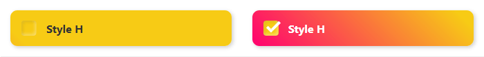
Style H
<label class="checkbox style-h">
  <input type="checkbox"/>
  <div class="checkbox__checkmark"></div>
  <div class="checkbox__body">Style H</div>
</label>
.checkbox.style-h {
  display: block;
  position: relative;
  cursor: pointer;
  -webkit-user-select: none;
  -moz-user-select: none;
  -ms-user-select: none;
  user-select: none;
}
.checkbox.style-h input {
  position: absolute;
  opacity: 0;
  cursor: pointer;
  height: 0;
  width: 0;
}
.checkbox.style-h input:checked ~ .checkbox__checkmark {
  background-color: #f7cb15;
}
.checkbox.style-h input:checked ~ .checkbox__checkmark:after {
  opacity: 1;
  top: -3px;
}
.checkbox.style-h input:checked ~ .checkbox__body {
  background-position: 0 0;
  color: #fff;
}
.checkbox.style-h:hover input ~ .checkbox__checkmark {
  background-color: #f7cb15;
}
.checkbox.style-h:hover input:checked ~ .checkbox__checkmark {
  background-color: #f7cb15;
}
.checkbox.style-h:hover .checkbox__body {
  box-shadow: 5px 5px 10px rgba(0,0,0,0.2);
}
.checkbox.style-h .checkbox__checkmark {
  position: absolute;
  top: 50%;
  transform: translateY(-50%);
  left: 15px;
  height: 22px;
  width: 22px;
  background-color: #f7cb15;
  transition: background-color 0.25s ease;
  border-radius: 4px;
  box-shadow: inset 2px 2px 4px rgba(0,0,0,0.1), inset -2px -2px 4px rgba(255,255,255,0.4);
}
.checkbox.style-h .checkbox__checkmark:after {
  content: "";
  position: absolute;
  left: 10px;
  top: -15px;
  width: 10px;
  height: 20px;
  border: solid #fff;
  border-width: 0 4px 4px 0;
  transform: rotate(45deg);
  opacity: 0;
  transition: opacity 0.25s ease, top 0.25s ease;
}
.checkbox.style-h .checkbox__body {
  color: #333;
  line-height: 1.4;
  font-size: 16px;
  transition: font-weight 0.25s ease;
  font-weight: bold;
  color: #333;
  background: linear-gradient(45deg, #ff0070 0%, #f7cb15 50%, #f7cb15 50%, #f7cb15 100%);
  background-size: 200% 100%;
  background-position: 100% 0;
  padding: 15px;
  padding-left: 52px;
  border-radius: 10px;
  box-shadow: 2px 2px 5px rgba(0,0,0,0.2);
  transition: box-shadow 0.25s ease, background 1s ease, color 0.25s ease;
}
Style I

<label class="checkbox style-i">
  <input type="checkbox"/>
  <div class="checkbox__checkmark"></div>
  <div class="checkbox__body">Style I</div>
</label>
.checkbox.style-i {
  display: block;
  position: relative;
  cursor: pointer;
  -webkit-user-select: none;
  -moz-user-select: none;
  -ms-user-select: none;
  user-select: none;
  padding-left: 65px;
}
.checkbox.style-i input {
  position: absolute;
  opacity: 0;
  cursor: pointer;
  height: 0;
  width: 0;
}
.checkbox.style-i input:checked ~ .checkbox__checkmark {
  background-color: #49db44;
}
.checkbox.style-i input:checked ~ .checkbox__checkmark:after {
  transform: rotate(90deg) translateY(-50%) translateX(-50%);
  background-color: #49db44;
}
.checkbox.style-i .checkbox__checkmark {
  position: absolute;
  top: 0;
  left: 0;
  height: 50px;
  width: 50px;
  background-color: #ff0070;
  transition: background-color 0.25s ease;
  border-radius: 50%;
}
.checkbox.style-i .checkbox__checkmark:after {
  content: "";
  position: absolute;
  left: 50%;
  top: 50%;
  width: 80%;
  height: 12px;
  border-radius: 6px;
  transform: rotate(0deg) translateY(-50%) translateX(-50%);
  transform-origin: left top;
  background-color: #ff0070;
  transition: transform 0.25s ease, background-color 0.25s ease;
  box-shadow: 2px 2px 4px rgba(0,0,0,0.2), -2px -2px 4px rgba(255,255,255,0.6);
}
.checkbox.style-i .checkbox__body {
  font-weight: bold;
  font-size: 30px;
}
Основано на - How TO - Custom Checkbox
Эффект Neumorphism - https://neumorphism.io/

Похожие записи
Выбор диапазона значений на основе плагина noUiSlider
В статье рассмотрим один из вариантов, как сделать выбор диапазона значений, который обычно используется в фильтрах интернет-магазинов
Создаём графики на основе плагина Chart.js (обновлено 17.08.2021)
В данной статье рассмотрим вариант создания графиков на основе плагина Charts.js